It's hard to avoid bad news about rising mortgage rates in 2022, but you can't believe everything you read. It is true that mortgage rates have been surging higher in 2022. The most recent newsletter goes into greater detail about the root causes, but in a nutshell:
- the pandemic pushed rates significantly lower at first
- the Fed was very aggressive in stimulating the economy via low policy rates and bond buying that lowered long-term rates
- inflation began to pick up due to supply chain issues and surprisingly resilient demand
- but the Fed continued providing accommodation for several reasons including uncertainty over covid variants, an updated inflation framework that allowed for more inflation, and the mistaken assumption that inflation would calm down more readily than it has
- the Fed finally began to tighten policy in late 2021, and got incrementally tougher over the following months
- the Ukraine war caused a quick head fake that initially helped rates recovery, but it was followed by a surge in inflation concern that caused the Fed to signal even more aggressive policy tightening
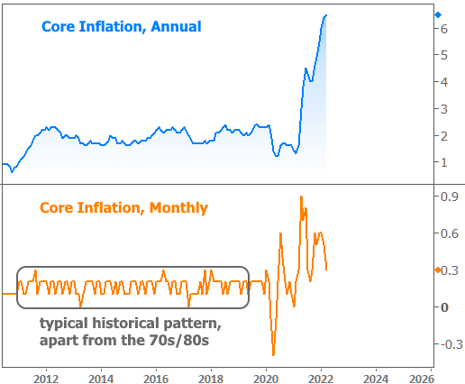
That's the saga of 2022's rate spike in a nutshell, but pictures do it more justice. Here's how inflation looks, both in monthly and annual terms:

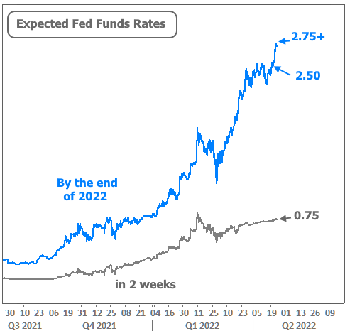
One of the reasons the Fed is so worried is that this chart really doesn't convey much of the new inflation expected as a result of the Ukraine war. In other words, the big spike in the middle of 2021 (orange line) might have been the peak, but Ukraine increased the odds of a resurgence. The Fed has responded with the most aggressive tightening in modern memory. Here's how Fed rate hike expectations have evolved:

This week alone, the market priced in another 0.25% hike in the Fed Funds Rate by the end of the year (blue line above). From the beginning of the year, rate expectations have risen roughly 2 percent!
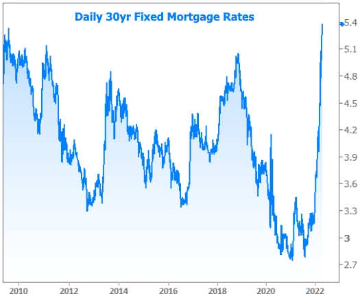
Short term rates (like the one set by the Fed) don't dictate mortgage rates, but they are correlated. More importantly, the Fed is simultaneously chopping its bond purchases and will soon begin shrinking its holdings of mortgages and Treasuries. These words and actions aren't as important to understand as the effects, and those are easily seen in a long-term chart of mortgage rates.

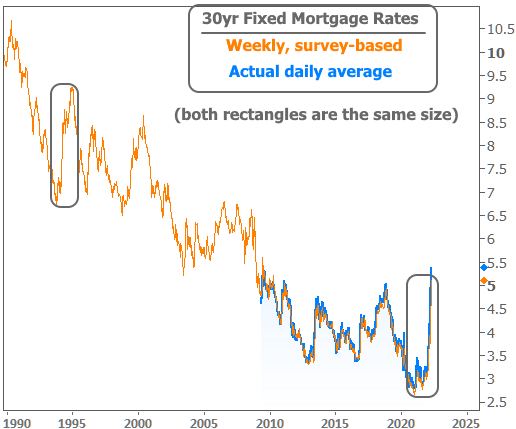
If it looks like that's the biggest, sharpest move in a long time, that's because it is! You'd have to go back to 1994 to see anything on the same scale, but as of this week, the current move is actually a bit bigger.

If we look deeper into the past, however, things have certainly been worse--WAY worse.

Still, all of the volatility has created some confusion when it comes to pinning down the "going rate" for a regular old 30yr fixed mortgage. Usually this doesn't matter too much because rates are stable enough that multiple sources are saying roughly the same thing. Amid this historic volatility, however, some of the survey-based sources are lagging well behind actual daily averages.
Specifically, Freddie Mac's widely-cited weekly survey is running at least a quarter of a point behind reality right now (5.11% compared to the most prevalently quoted rates coming out in the 5.375-5.5% range). In that sense, rates are meaningfully higher than you've been told.
Then there are the truly bizarre sources of rate data that made the rounds on Friday. In fact, we don't even know where this number came from, but several websites reported rates of 6.75%! This is so unimaginably high compared to reality as to be comical, at least if we're talking about the typical best-case scenario rates.
It is actually conceivable for certain scenarios to see rates over 6%, but to be sure, mortgage rate headlines are never based on those scenarios. In other words, someone dropped the ball in a major way and for anyone who saw (and believed) those 6.75% headlines, rates are thankfully much lower than you've been told.
Perhaps the more important question is how much higher they may go. As is so often the case, 'it depends.' Going back to our bullet points and inflation chart above, we know inflation is a critical consideration for the Fed and that Fed policy is a critical consideration for rates, and that we're waiting to see more of an impact from higher commodity prices due to the war. That picture will start coming into better focus in 3 weeks when the April installment of the Consumer Price Index is released (the chart above was updated with March data as of last week).
In the meantime, some market participants may look to next week's PCE inflation data for additional insight, but that too is only through March. The more important development will be the Fed announcement in the following week--not because of the 0.50% rate hike (that's a foregone conclusion)--but rather because the Fed stands a good chance of announcing a very big reduction in its bond purchases via balance sheet normalization (the subject of the previous newsletter linked at the top of this one). If the Fed pulls the trigger on balance sheet normalization in as aggressive a manner as laid out in the minutes from the last meeting, rates could face more upward pressure.
On a tangential note, not too long ago, referring to a 0.50% Fed rate hike as a foregone conclusion would have been absurd. The speed with which the market has come to accept the rate outlook has some people asking why the Fed is being so aggressive in trying to control inflation and whether they've even been this aggressive in the past.
The answer is an emphatic "YES!" The chart below shows the Fed Funds rate as well as the month-over-month change in the Fed Funds Rate. Without speaking in absolutes, we can leave it at this. There were multiple months in the early 80s when the Fed Funds rate rose more than 1.5% and one month where it jumped more than 2.5, ultimately topping out at 19%. This time around, the debate has been between jumps of 0.5% and 0.75%, with current expectations calling for a top in the 3-4% range before settling at 2.5%.


