


Rates may not be as high as they were several months ago or as low as they were 5 weeks ago, but they're close enough to either boundary that the threat (or promise) of returning is palpable. For at least the past 2 weeks, we'd been waiting for this week's events to give us some sort of push higher or lower, but it looks like the waiting will continue.
The two key events in question were Tuesday's release of the Consumer Price Index (CPI) and Wednesday's Fed Announcement. CPI is the most widely followed inflation metric among regularly scheduled economic reports. It comes out once a month and has had a huge impact on rates many times over the past 2 years. This time around, it happened to be scheduled to come out a day before a particularly important Fed policy announcement.
Year-over-year CPI was destined to continue falling in this week's report simply because it was so high 13 months ago (i.e. it's a 12 month calculation and there was no way the current month would be as bad as the month that just got bumped out of the equation).
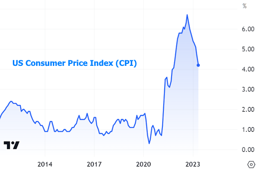
Month-over-month numbers filter out the impact of the past and show more detail. This is where we see the first stalemate that went unresolved this week. Simply put, month-over-month inflation remained perfectly inside the increasingly narrow sideways range that's been intact for almost 2 years. This offered precious little guidance for the Fed announcement the following day.

Most of the market expected the Fed to hold its policy rate steady at this meeting. "Policy rate" refers to the Fed Funds Rate which applies to overnight lending between large financial institutions--something that changes no more than once every 6 weeks and that has a limited impact on things like mortgage rates by the time the Fed actually hikes/cuts.
Longer term rates (like those for mortgages) are far more interested in the forward-looking trajectory of the Fed's rate path. At every other meeting, the Fed releases a Summary of Economic Projections. The crowd favorite is "the dots"--a reference to the dot plot that shows each Fed member's assumptions about where the policy rate will be in the near future.
This instance of the dots was particularly interesting because it would offer insight as to whether the Fed was indeed simply pausing rate hikes or if it thought it might have reached the ceiling. On that topic, the dots left little to the imagination with the average vote clearly moving 0.50% higher, thus implying 2 more rate hikes in 2023. All that without any strong guidance from the CPI data. One can imagine the dots may have been higher if CPI had come in hot.
Markets were initially unhappy to see the Fed's inclination toward even tighter policy, but found solace in the press conference with Fed Chair Powell. In it, he offered his typical reminder that the dots are merely projections and not predictions or forecasts (whatever that means). If he could speak more candidly, he'd likely say something like "the dots are just a guess based on how things look today. We force these people to pick a number. Most pick wrong. And depending on how the economy changes, most will change their guess in 12 weeks when the next dots come out."
Powell went on to say that the Fed hadn't even decided that it would hike rates at all again. It would be taking the decision on a meeting by meeting basis depending on how the data evolved. To say that places increased emphasis on economic reports would be an understatement. With some showing strength and others promising recession, it's no surprise to see a volatile, sideways range remain intact.
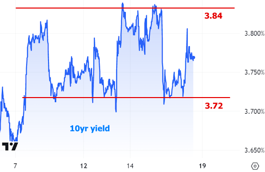
In terms of 10yr yields, the short term sideways range is probably too narrow to last much longer, but it has offered solid guideposts recently.
In the bigger picture, the range isn't as perfectly sideways. It's more of a battle to return under the 3.4% level.
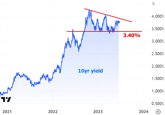
As per usual, the trends in 10yr yields substantially reflect the trends in mortgage rates.

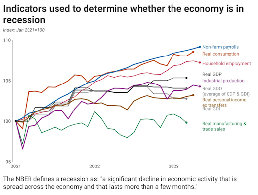
So what does the data say about how things might evolve in the near future? Truly, that's up for debate! The following chart from economist Justin Wolfers made rounds on Friday, tacitly shouting that it's ridiculous to expect a recession right now based on most economic data.
At almost exactly the same time, Wells Fargo economists put out their weekly note with some thoughts on recent trends in the Leading Economic Indicators index ahead of next week's update, saying:
"In a world chock-full of backward-looking economic data, forward-looking indicators like the Leading Economic Index (LEI) are decidedly valuable. Unfortunately, the LEI has been quite consistent in its signal of recession. The six-month average change of this index has registered below the threshold historically consistent with a downturn for 10 straight months. The LEI’s downdraft is also picking up speed, suggesting that a turn in the business cycle is more likely than not."

It's quite easy to ping pong the debate back and forth between "recession" and "it's not so bad" with other data out this week. While we're on the topic of sentiment surveys how about Consumer Sentiment itself? It may be historically low, but it has also been trending fairly consistently higher (in stark opposition of the trend seen in the chart above).

On a more recessionary note, weekly jobless claims have hit the highest levels since 2021 on two consecutive weeks.

And if we filter out the noise associated with the pandemic, these are actually the highest levels since late 2017.

As long as there are compelling ways to make cases for opposite economic outcomes, rates will find it easier to remain broadly sideways, but with big, volatile swings between the prevailing highs and lows. It's a waiting game for now.
