


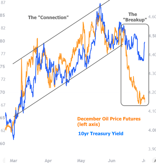
For 3 months, they were almost inseparable. Then in June, they went their separate ways. Now oil and rates are back together in July, for the most part.
Specifically, movement in oil prices was highly correlated with movement in rates (represented below by 10yr Treasury yields) after the onset of the Iran war. The reasoning was simple: higher fuel prices implied higher inflation, and higher inflation tends to result in higher rates.
The oil/rates correlation is never perfect, but it generally remained strong until ceasefire confirmation in early June. At that point, oil went south while bonds decided to stick around for a while for their own reasons (and also because gas/diesel prices haven't fallen nearly as fast as oil prices).
Before continuing, let's be clear on the oil/rate relationship in the bigger picture. Because fuel is so central to inflation and because inflation is so central to rates, it's tempting to conclude that oil and rates should always be correlating to some extent. In practice, bonds have a lot of other things on their mind besides inflation. This results in noticeable departures from the correlated trend over the years.
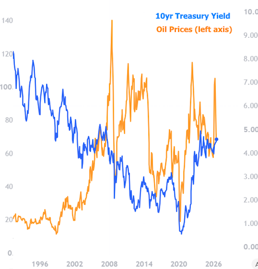
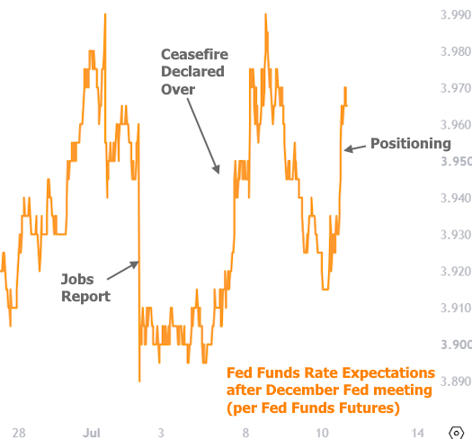
Nonetheless, recent correlation is understandable given the violence of the move in oil/fuel prices combined with an absence of other strong motivations for the bond market. This point was driven home last week when the jobs report caused a big bond-specific reaction that didn't involve oil.
The present week was a different story. Bonds/rates had very little by way of new motivation or data. Meanwhile, the end of the U.S./Iran ceasefire was big news for oil. Prices spiked and the apathetic bond market was quickly willing to be taken along for the ride.
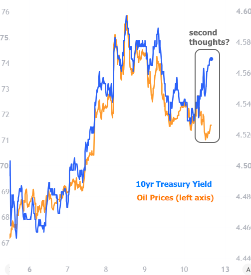
As the chart above shows, July has seen a high degree of correlation return. The only hitch was on Friday afternoon when bond yields continued to drift higher as oil prices remained lower day-over-day. There are a number of ways to justify this, but the simplest would be that traders were positioning for next week's testimony from Fed Chair Warsh as well as two key inflation reports. Adding credence to this theory is the fact that Fed Funds Futures experienced an even sharper move than longer-term Treasuries.
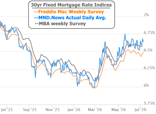
If all of the above sounds a bit dramatic, mortgage rates agree. The Treasury charts place rate volatility under a microscope. In the bigger picture, mortgage rates are merely drifting sideways in a fairly narrow range--albeit a range near the 10-month highs.