This week's newsletter is all about context when it comes to economic data and market movement. One point of view may provide a clear takeaway while zooming out completely changes the picture.
Let's start with an easy one. The early January mortgage rate rally led to an obvious surge in refinance applications. Taken together with the mini refi boom in September 2025, things look pretty active, even after accounting for last week's modest decline from the highs.
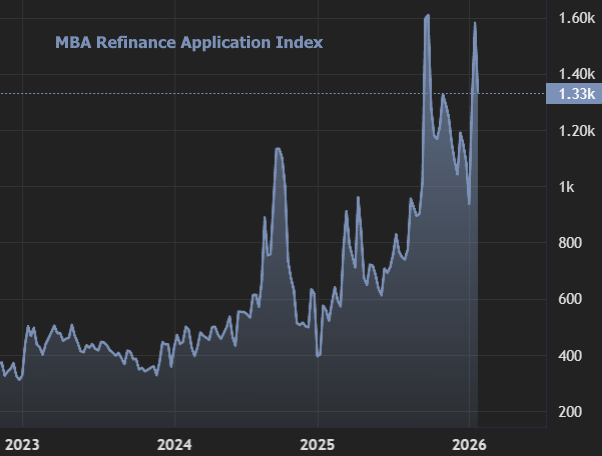
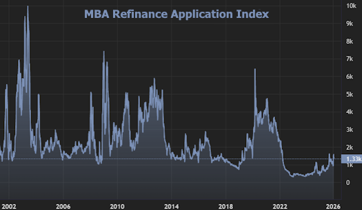
But if we zoom out to include history's actual refi booms, we find that the present example--while still a meaningful improvement from where we were--merely gets us back in line with historical lows.
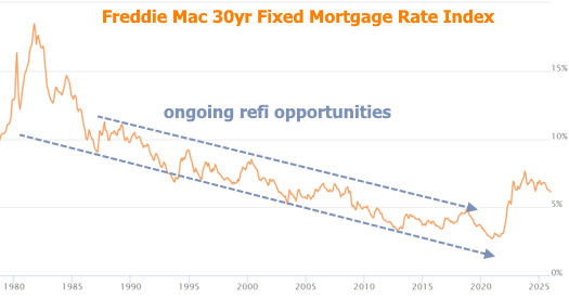
Context is important here too, because for most of the time seen in the chart above, rates were declining from all-time highs in the early 1980s. As such, there were rolling opportunities to refinance again and again. With rates hitting all-time lows in 2021 and moving higher since then, the only decent refi opportunities have been for those who bought new homes when rates were higher over the past few years.
Similar caveats apply when it comes to home prices. In data released this week, home prices appreciated at their fastest monthly pace in over a year.
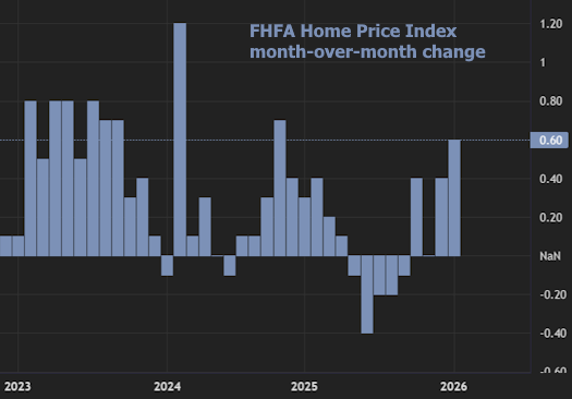
Zooming out to a wider frame of reference is only the first of several "yeah buts," and it shows prices simply enjoyed what had historically been a decent month of improvement.
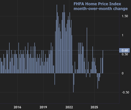
So is this a result of the recent drop in rates? Not exactly. In fact, that question could only really be asked of September's drop in rates because the home price data is for the month of November. Prices don't have a lot of immediate sensitivity to rates in general. If the most recent rate rally made a difference, it'll be 2-3 months before it shows up in the data.
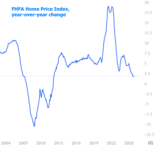
The 3rd caveat on the price data is that month-to-month charts aren't as useful as year-over-year charts in capturing broad trends. The following chart has the same FHFA home price index seen above, but expressed in year-over-year terms. In other words, this is the annual pace of home price appreciation--still positive, but the slowest growth since the financial crisis.
If the chart above gives you any sort of downbeat feeling about home prices, don't stress out too much. The next chart is the same exact data, in completely raw format. In other words, the previous charts have captured percent in monthly or annual terms. This chart is the underlying data that's being measured: the actual FHFA Home Price Index.
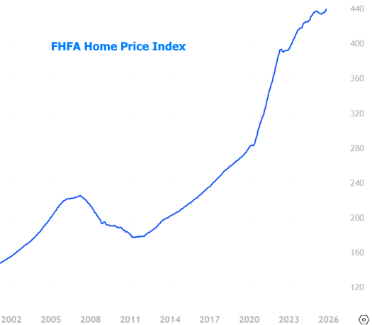
Yep, that's at all time highs--just not surging higher as fast as it had been (which may be a good thing, depending on one's thoughts on sustainability).
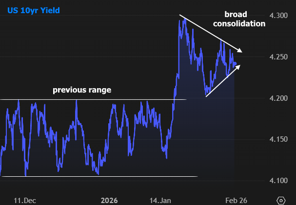
Context matters in financial markets too. If we only look at this week in the rate market, US Treasuries suggest things were fairly volatile--perhaps with some reaction to Wednesday's Fed Announcement.
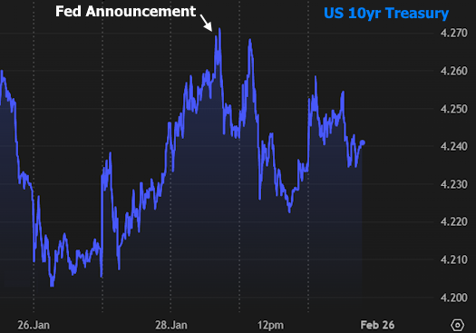
In the slightly bigger picture, bonds/rates are just consolidating after the more violent breakout seen last Monday. In fact, none of this week's economic data or other scheduled events had a huge impact.
There's more legitimate opportunity for data-driven volatility in the week ahead as it brings the month's most important slate of economic reports. Strong supporting actors include ISM reports on manufacturing and services (Mon/Wed), Job Openings (Tue), and ADP Payrolls (Wed). As always, the heaviest hitter of all in terms of potential volatility will be Friday's big jobs report.